
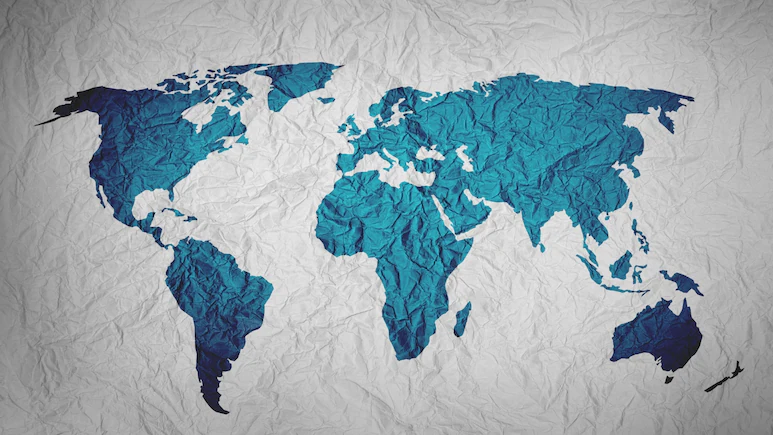
The world map most of us have grown up seeing may not show the world as it really is.
The United Nations has backed a move to replace the widely used Mercator map with the Equal Earth projection, which gives a more accurate picture of the size of continents and countries. The difference becomes clear when Africa is compared with Greenland. On the Mercator map, the two can look almost similar in size. Why Did UN Switch Maps? The Earth is round, but a world map is flat. That means it is impossible to show the entire planet on a flat surface without changing something. So, the map stretches areas as they get closer to the North and South Poles. Greenland Looks As Big As Africa. But It Isn’t One of the best-known examples is Greenland and Africa. On a Mercator map, Greenland can appear almost as large as Africa. But the reality is very different. The same distortion affects other parts of the world. Meanwhile, Africa, South America, and other areas closer to the equator can appear smaller than their actual size. India also appears slightly larger when it is shown on the Equal Earth projection. What Is Equal Earth Map?
Because lines showing a constant compass direction could be drawn as straight lines, it made it easier for sailors to plot routes. Countries in higher latitudes therefore appear much larger than they really are. Because of their location at higher latitudes, russia, Canada, Europe, and North America can appear much larger.
But in reality, Africa is about 14 times larger than Greenland. The Mercator projection, created by Flemish cartographer Gerardus Mercator in 1569, was mainly designed for navigation. Africa is roughly 14 times larger than Greenland.
Kenyan geographer Kioko Muendo told the BBC that maps are not just tools for finding places. “They shape how regions are perceived politically and economically,” he said.
Its main aim is different from Mercator’s. Instead of focusing on navigation, Equal Earth tries to show the relative size of landmasses more accurately. When the two maps are placed side by side, the difference is easy to see, as Africa appears much larger on Equal Earth. North America and Europe appear smaller than they do on Mercator. South America also gets closer to its actual size, while the exaggerated appearance of areas near the poles is reduced. India appears slightly larger as well. The new projection gives a better idea of how much land different parts of the world actually occupy. The Equal Earth projection was also adopted by African Union members in February. Equal Earth Has A Problem Too But Equal Earth is not perfect either. It gives up some of the features that made Mercator useful for navigation. Straight lines on the Earth do not work in the same way as they do on Mercator. It also cannot be used to measure the true distance between different places perfectly. As UCL cartography professor James Cheshire explained, “A map can preserve area, shape, distance and direction to different degrees but it cannot preserve all of them perfectly. What About Peters Map? The Peters projection is another attempt to solve the problem of countries appearing larger or smaller than they really are. Like Equal Earth, the Peters map gives a fairer idea of the actual area of different countries and continents. But it does this by changing their shapes. Polar regions are squeezed, while areas closer to the equator are stretched. Russia, for example, appears much smaller. Is There Any Single Perfect Map? There is no single perfect world map. The Mercator map gets direction and navigation right but distorts size. The Peters map gets area closer to reality but distorts shape. Equal Earth aims to give a more balanced and accurate picture of the size of landmasses, although it cannot preserve every feature perfectly.
Because there is no flat map that can preserve everything at once, this is. Because a round Earth cannot be completely flattened without distortion, every projection involves some compromise. The Equal Earth projection was developed by a team of cartographers in 2018. It was designed by German historian Arno Peters in the early 1970s, although it is based on a projection first described by Scottish cartographer James Gall in 1855.
